This guide shows how to build an interactive React candlestick chart from OHLCV data using react-candlesticks.
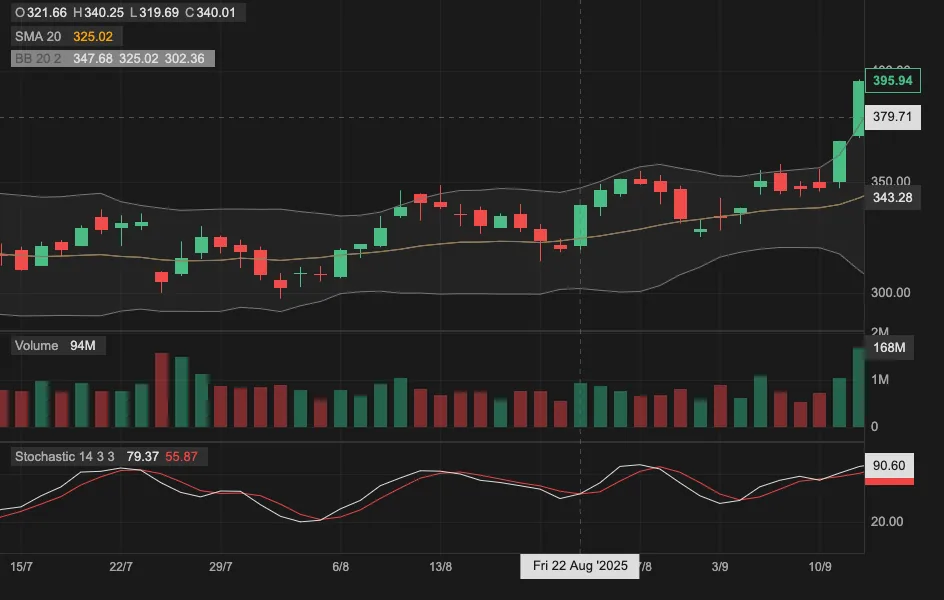
You will start with a candlestick price chart, then add volume, indicators, theming, and interactive chart controls. The library uses Canvas for drawing while the chart structure is composed from React components.
What you will build
- A working React candlestick chart that takes OHLCV data as input
- A candlestick price panel
- A volume panel
- SMA and Bollinger Bands overlays
- A Stochastic indicator panel
- A dark theme
- Crosshairs, zoom, scrolling, and hover legends
You can also try the live StackBlitz demo before installing anything.
Install the React candlestick chart library
Install react-candlesticks from npm:
npm install react-candlesticksThen import the stylesheet once in your app:
import 'react-candlesticks/style.css';react-candlesticks supports React 18 and 19, includes TypeScript definitions, and is distributed as an ES module for modern React applications.
OHLC data format for a React candlestick chart
A candlestick chart visualizes OHLC data. Each point contains:
open,high,low, andclosepricesvolumetraded during the intervaltimeidentifying the interval
In react-candlesticks, each data point should look like this:
import type { DataPoint } from 'react-candlesticks';

const data: DataPoint[] = [
  {
    time: '2022-05-19T00:00:00Z',
    open: 707,
    high: 734,
    low: 694.11,
    close: 709,
    volume: 3029807,
  },
  // more bars...
];
The time field should be an ISO 8601 UTC date and time string ending in Z, such as '2022-05-19T00:00:00Z' for a daily candle or '2022-05-19T09:30:00Z' for an intraday candle.
Build a minimal React candlestick chart
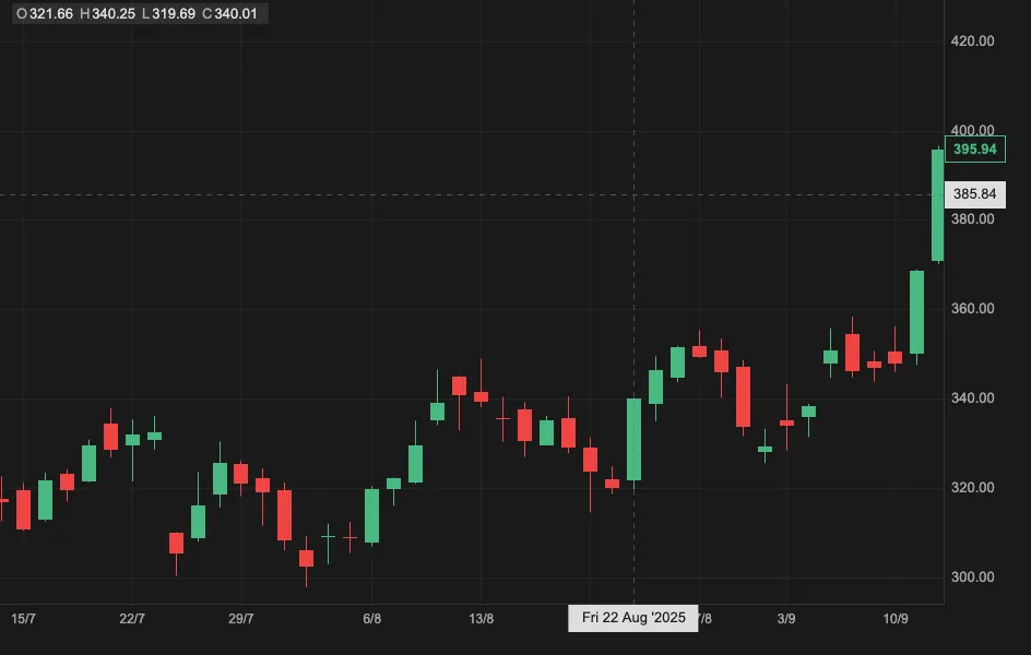
Here is the smallest useful React candlestick chart example: one chart, one panel, and one candlestick layer.
import 'react-candlesticks/style.css';
import './App.css';
import {
  Chart,
  Panel,
  Candlesticks,
  exampleData,
} from 'react-candlesticks';

export default function App() {
  return (
    <div style={{ width: '100vw', height: '100vh' }}>
      <Chart granularity="d1" data={exampleData} theme="dark">
        <Panel>
          <Candlesticks />
        </Panel>
      </Chart>
    </div>
  );
}
The chart is composed from React components:
<Chart>owns the data, time scale, theme, and interactions.<Panel>creates a vertical chart area.<Candlesticks>is a chart layer that draws candlesticks from the OHLC data.granularity="d1"identifies the data as daily candles.theme="dark"selects the dark theme. A light theme is also provided, and custom themes are supported.
exampleData is an OHLCV dataset included with the package for demonstrations. Replace it with your own DataPoint[] when integrating the chart.
The chart fills its container, so the container must have measurable width and height. The example uses the viewport dimensions; you can instead size the container with your application CSS or pass explicit width and height props to <Chart>.
The StackBlitz demo also imports App.css to remove the browser's default body margin and prevent scrollbars around the full-viewport chart:
html,
body,
#root {
  width: 100vw;
  height: 100vh;
  margin: 0;
  padding: 0;
  overflow: hidden;
}
Add a volume panel below the candlesticks
To show volume below the price chart, add a <VolumeBars /> layer inside a second panel.
import 'react-candlesticks/style.css';
import './App.css';
import {
  Chart,
  Panel,
  Candlesticks,
  VolumeBars,
  exampleData,
} from 'react-candlesticks';

export default function App() {
  return (
    <div style={{ width: '100vw', height: '100vh' }}>
      <Chart granularity="d1" data={exampleData} theme="dark">
        <Panel heightRatio={3}>
          <Candlesticks />
        </Panel>
        <Panel>
          <VolumeBars />
        </Panel>
      </Chart>
    </div>
  );
}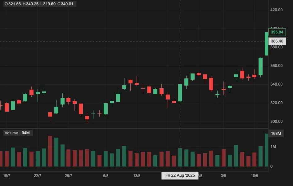
The heightRatio={3} prop makes the price panel three times taller than the volume panel.
Add technical indicators
Indicators can be added as React components, either overlaid on the price panel or placed in separate panels. This example overlays an SMA and Bollinger Bands on the price chart, then adds a Stochastic panel below the volume.
import 'react-candlesticks/style.css';
import './App.css';
import {
  BollingerBands,
  Candlesticks,
  Chart,
  Panel,
  SMA,
  Stochastic,
  VolumeBars,
  exampleData,
} from 'react-candlesticks';

export default function App() {
  return (
    <div style={{ width: '100vw', height: '100vh' }}>
      <Chart granularity="d1" data={exampleData} theme="dark">
        <Panel heightRatio={3}>
          <Candlesticks />
          <SMA period={20} />
          <BollingerBands />
        </Panel>
        <Panel>
          <VolumeBars />
        </Panel>
        <Panel>
          <Stochastic />
        </Panel>
      </Chart>
    </div>
  );
}This produces candlesticks, a 20-period simple moving average, and Bollinger Bands in the main panel, with volume and Stochastic panels below. Each layer remains a React component, so you can add, remove, or configure studies without maintaining one large chart configuration object.
Customize the candlestick chart
You can start with the built-in light or dark theme, then customize individual chart layers where your product needs a more specific visual treatment.
<Candlesticks
  series={{
    body: {
      up: {
        backgroundColor: 'dodgerblue',
        borderWidth: 0,
      },
      down: {
        backgroundColor: 'white',
        borderColor: 'dodgerblue',
        borderWidth: 1,
      },
    },
    wick: {
      up: { color: 'dodgerblue' },
      down: { color: 'dodgerblue' },
    },
  }}
/>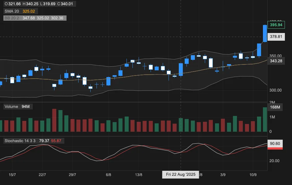
Use a custom theme to match the chart to your application. Use layer props when you only need to change a particular element, such as candle colors, axis labels, markers, or indicator lines.
For working examples, see the customization guide and theme API.
Use minimal mode for watchlists and small charts
Watchlists, stock screeners, crypto dashboards, and card grids often need many compact charts on one screen. For that case, use renderMode="minimal":
<Chart
  renderMode="minimal"
  pixelRatio={1}
  width={120}
  height={60}
  granularity="d1"
  data={data}
>
  <Panel>
    <Candlesticks yAxis={false} legend={false} />
  </Panel>
</Chart>
Minimal mode disables crosshairs, the grid, x-axis, borders, scrolling, and zoom by default. You can opt individual features back in when needed. Setting pixelRatio={1} also reduces rendering work when many small charts are visible at once.
Why use Canvas for a React candlestick chart?
Financial charts have different demands from ordinary dashboard charts. A trading chart may redraw many candles during zooming, panning, and pointer movement while keeping price, volume, and indicator panels synchronized.
react-candlesticks uses Canvas for performance-sensitive drawing while React handles the declarative chart structure. You compose panels and layers as components instead of manually coordinating drawing code, axis scales, crosshairs, scroll state, and indicator rendering.
React candlestick chart FAQ
Can I use react-candlesticks with Next.js or another SSR framework?
Yes. Render the chart from a client component or client-only boundary because chart rendering and interaction depend on browser APIs.
Does react-candlesticks provide market data?
No. The package includes exampleData for demonstrations, but applications provide their own OHLCV data from an API, data feed, or other source.
How do I start the chart at the latest data?
Add the initialScrollToLatest prop to <Chart>. On the initial render, the chart scrolls to the most recent candles instead of starting at the beginning of the dataset.
Which browser features does react-candlesticks require?
The chart uses standard browser APIs including Canvas, ResizeObserver, matchMedia, devicePixelRatio, and Pointer Events. Older browsers or restricted webviews may require compatibility checks or polyfills.
Next steps
You now have a React candlestick chart with volume, indicators, theming, and interactive chart controls. Replace exampleData with your own OHLCV data, then configure the panels and layers required by your application.
npm install react-candlesticksTry the live demo, follow the getting started guide, browse more examples, or explore the API reference. The package is also available on npm, and its source is on GitHub.