react-candlesticks is an open-source React/TypeScript library for financial charts: candlesticks, volume, technical indicators, theming, and (still early) support for custom layers and drawings. Panels and layers are separate components you assemble in JSX, and Canvas is used to handle the rendering underneath.
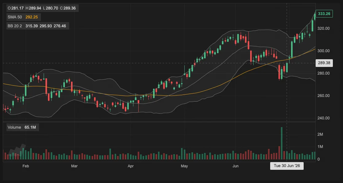
I developed it because I needed candlestick charts for a trading app I was building. I began a couple of years ago, then it sat idle for a while, but more recently I decided to get it into a sharable state and make it open source.
Roughly, the goals were:
- simple charts should be quick to create
- advanced charts should be fully configurable
- separate components for panels and layers
- everything styleable / themable
- nice feeling scroll and zoom
- decent performance on larger charts
- no extra runtime dependencies
A basic chart
Install from npm:
npm install react-candlesticksA simple candlestick chart with volume looks like this:
import 'react-candlesticks/style.css';

import {
  Candlesticks,
  Chart,
  Panel,
  VolumeBars,
  exampleData,
} from 'react-candlesticks';

export default function App() {
  return (
    <Chart data={exampleData} granularity="d1" theme="dark">
      <Panel heightRatio={3}>
        <Candlesticks />
      </Panel>

      <Panel>
        <VolumeBars />
      </Panel>
    </Chart>
  );
}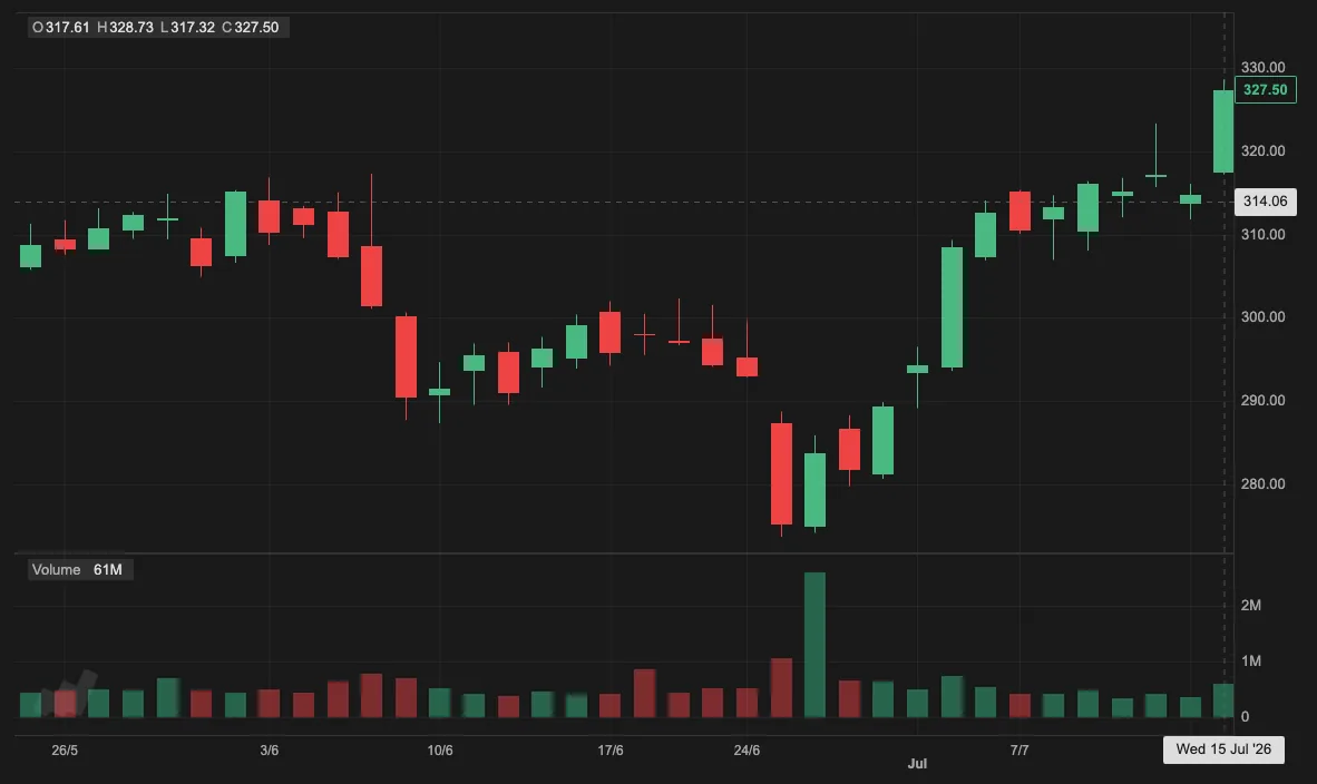
react-candlesticks chart with candlesticks and volume panels.Panels stack vertically and layers are added within them. You can stack multiple layers with the same scale into one panel. Different scales per panel isn't supported yet.
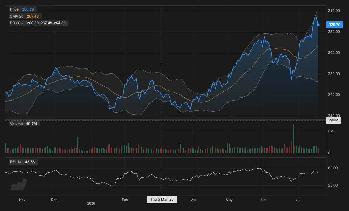
A multi-panel chart with a couple of overlays and an oscillator looks like this:
<Chart data={data} granularity="d1">
  <Panel heightRatio={3}>
    <Candlesticks />
    <SMA period={20} />
    <BollingerBands />
  </Panel>

  <Panel>
    <VolumeBars />
  </Panel>

  <Panel>
    <RSI />
  </Panel>
</Chart>
Because it's React components, panels and indicators can be rendered conditionally like anything else in your UI:
export default function App() {
  const chartType = 'candlestick'; // 'candlestick' | 'ohlc' | 'area'
  const showVolume = true;
  const showSMA = true;
  const showBollingerBands = false;
  const showRSI = true;

  return (
    <Chart data={exampleData} granularity="d1" theme="dark">
      <Panel heightRatio={3}>
        {chartType === 'candlestick' && <Candlesticks />}
        {chartType === 'ohlc' && <OhlcBars />}
        {chartType === 'area' && <Area />}

        {showSMA && <SMA period={20} />}
        {showBollingerBands && <BollingerBands period={20} />}
      </Panel>

      {showVolume && (
        <Panel>
          <VolumeBars />
        </Panel>
      )}

      {showRSI && (
        <Panel>
          <RSI period={14} />
        </Panel>
      )}
    </Chart>
  );
}
You can add, remove, or reconfigure layers and it behaves the way you'd expect a React tree to behave, including on re-render when state changes.
Zero runtime dependencies
There are no runtime dependencies beyond the React and React DOM peer deps. I wanted to avoid future third-party dependency headaches.
Built-in and custom chart layers
Chart layer types included (so far):
- Candlesticks
- OHLC bars
- Area charts
- Line charts
- Volume bars
- SMA
- EMA
- Bollinger Bands
- RSI
- MACD
- Stochastic
- ATR
- ADX
- CCI
- OBV
- Parabolic SAR
- Williams %R
More indicators are planned.
You can also define your own layers with the defineLayer prop on Chart. See the docs for examples.
Drawings
Drawing support exists but is still rough. defineDrawing lets you define chart-scoped drawings (trend lines or anything that you can draw on Canvas). Drawings support hit testing and hover/click/drag handling. It needs more work before I'd call it done, but it's on the roadmap.
Events
Layers expose hover and click callbacks for things like candle bodies, wicks, and indicator lines, through onLayerHover and onLayerClick on Chart:
export default function App() {
  return (
    <Chart
      data={exampleData}
      granularity="d1"
      onLayerHover={(hit) => {
        if (!hit) return;

        console.log(hit.layerType, hit.target, hit.data);
      }}
      onLayerClick={(hit) => {
        console.log('clicked', hit.layerType, hit.target, hit.data);
      }}
    >
      <Panel>
        <Candlesticks />
        <SMA period={20} />
      </Panel>
    </Chart>
  );
}
A usage example would be displaying a tooltip on candlestick hover.
Theming
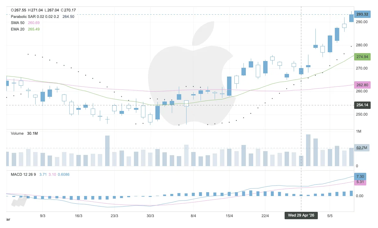
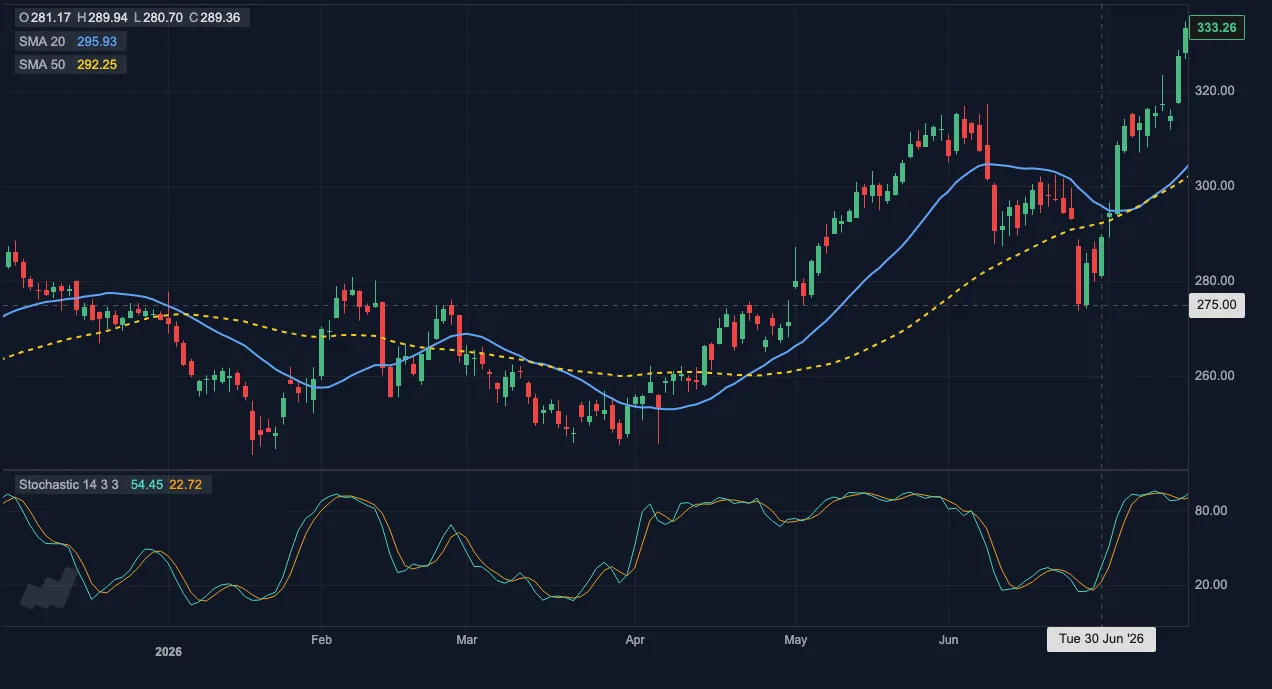
There's a light and dark theme built in. You can also pass a fully custom theme, or just override style config directly on individual layer components.
import type { Theme } from 'react-candlesticks';

const customTheme: Theme = {
  base: 'dark',
  chart: {
    backgroundColor: '#111827',
  },
  indicators: {
    linePalette: ['#2dd4bf', '#f59e0b', '#a78bfa'],
    positiveColor: '#34d399',
    negativeColor: '#fb7185',
  },
  layers: {
    sma: {
      series: {
        value: { color: '#60a5fa', width: 2 },
      },
    },
  },
};

export default function App() {
  return (
    <Chart data={data} granularity="d1" theme={customTheme}>
      <Panel heightRatio={3}>
        <Candlesticks />
        <SMA period={20} />
        <SMA
          period={50}
          series={{
            value: { color: '#facc15', width: 2, style: 'dashed' },
          }}
        />
      </Panel>

      <Panel>
        <Stochastic />
      </Panel>
    </Chart>
  );
}
Who should try it?
It's still early, so I wouldn't call it a drop-in replacement for a mature production charting platform. But if you specifically want candlestick charts in a React app, it's worth a look. It's quick to get started.
Session support is probably the biggest gap right now: regular and extended hours, holidays, and time zone mapping. The plan is to let exchange config be passed in, but I will include built-in configs for common exchanges too.
You can provide custom formatters for time-axis, value-axis and crosshair labels if you need to override the defaults.
Current status
Working today:
- candlesticks
- multi-panel layouts
- volume
- a small set of common indicators
- theming
- hover and click interactions
On the roadmap:
- more custom layer support
- better drawing support
- market sessions
- more built-in indicators
- time scale behavior
- indicator-to-indicator input sources
Try it
npm install react-candlesticksLinks:
The easiest way to get a feel for it is the live demo, then StackBlitz, then the GitHub repo and docs.
Feedback appreciated
Feedback from anyone building trading or financial apps would be genuinely useful right now. Start a GitHub discussion or create an issue.
Thanks for reading. And if you build something with it, I'd love to hear about it.